In radiology, we’d like deep learning models to identify patterns in imaging that suggest disease. For example, to detect pneumonia (lung infection), we’d like them to identify patterns in the lung that indicate the presence of an active infection. But do we know that is what they’re actually doing?
My collaborators and I recently released a preprint on arXiv examining how confounding variables may degrade the generalization performance of a CNN trained to identify pneumonia. Let me take a step back and give some examples of the problem that motivates this work.
Throughout this post, I will use the word ‘findings’ to describe features we see on an image that are directly caused by a given disease process. In an x-ray, a dark line between two pieces of bone is a finding that indicates a fracture. A patchy white appearance in the lungs can be caused by pneumonia (a lung infection) and so is a finding that can indicate pneumonia (though it can also indicate many other things; findings are not always specific for one disease).
Diagnosing cardiomegaly (enlarged heart)
Imagine we’ve trained a CNN to identify diagnoses on chest x-rays from NIH. We are curious to see how it’s making decisions, so we examine some x-rays that contain cardiomegaly, i.e. enlarged heart, and see which parts of the image the CNN found most useful in predicting cardiomegaly. If the CNN is working correctly, it would look at the heart.
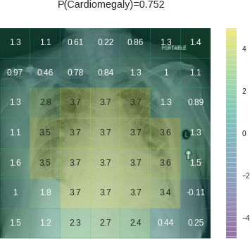
Let’s take a look at one (details on heatmap calculation given at end):


In this heatmap, positive values with green/yellow shading indicate regions of the image that contributed to a positive prediction of cardiomegaly. Negative values with blue/purple shading contributed to a negative prediction of cardiomegaly.
This heatmap looks encouraging at first— the model is looking at the massive heart, so it’s doing what it’s supposed to be doing. Heatmap regions are cut more widely than the region with findings because of convolutions (more detail at end), so it’s not surprising to see the yellow region overreach the heart a bit.
On second look though, it is strange to see the positive contributions at the edges of the image. It is especially strange to see high values on the PORTABLE label and the laterality marker (the L on the side, which technicians place on the patient), which likely belongs to this particular portable x-ray machine. It looks like the CNN is learning that portable x-rays are more likely to contain cardiomegaly — which is a pretty safe bet. Portable x-rays are done on patients so sick they cannot travel to the regular x-ray machine. A technician comes to the bedside and performs the x-ray in the patient’s room with the patient still in bed. Many of these patients have advanced heart disease, which can cause cardiomegaly.
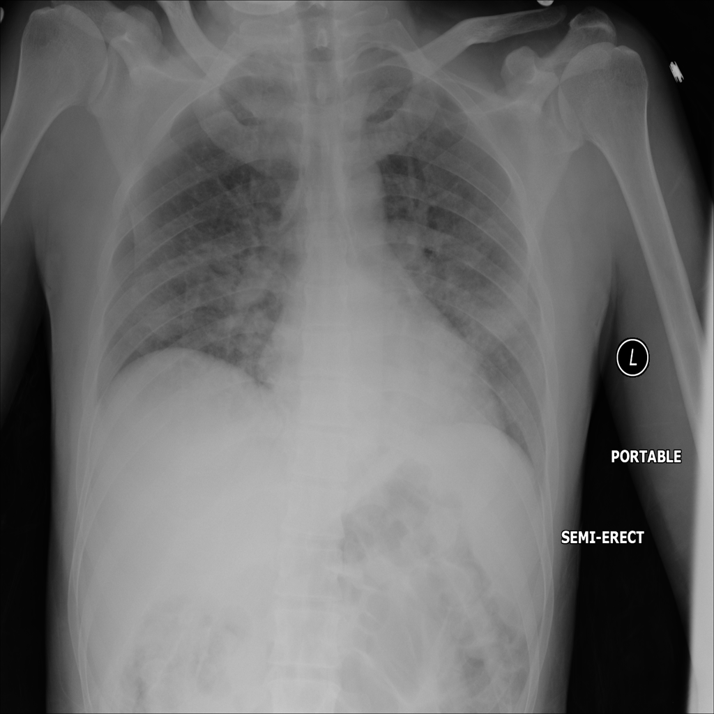
Let’s look another patient with cardiomegaly:


Again, we see the CNN classifying this one positively because it’s looking at the heart — that’s impressive! But this time, it downweighted cardiomegaly based on the areas that indicate the scanner on which it was acquired (indicated by the negative, blue squares surrounding the laterality marker in the upper right corner). This is a regular scan, not a portable one. Perhaps it is at a lower risk setting like an outpatient office — that would explain the lower risk of cardiomegaly the CNN calibrated towards.
For cardiomegaly, the CNN appears to be looking at the heart and using it to make its decision, but it’s using not only the heart — it’s also using whether the scanner is portable or not to calibrate its estimates up or down.
Pneumonia
Just like cardiomegaly findings should be in the heart, we would expect pneumonia (lung infection) findings to be in the lungs. Pneumonia can be harder to spot than cardiomegaly. Let’s see how the CNN does on a few cases.
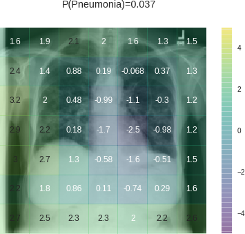
The CNN predicted that the next scan had a 5% predicted probability of pneumonia. While 5% predicted probability is low in absolute terms, it’s high compared to the 1.2% baseline probability in the dataset — this scan is at the 97.5th percentile for pneumonia probability in this dataset:


The findings that could indicate pneumonia appear primarily in the lower half of the right lung, but the CNN doesn’t give the right lung high values. In fact, it put negative numbers on two of the most concerning parts of the lower right lung. The strongest contributors to positive classification are the lower edges of the image frame. Maybe the framing allows the CNN to detect the scan protocol or the specific scanner. Depending on where a scanner is in a hospital, images from that scanner could have more cases of pneumonia or be read by a radiologist who has a higher propensity to suspect pneumonia on imaging. There are a number of ways that this feature could be connected to pneumonia probability. Whatever the case, it’s clear that the CNN learned the association. Learning that association let it make the right prediction here, even though it missed the actual imaging finding.
Let’s see another x-ray, one with 2.4% predicted pneumonia risk. Again, while 2.4% is low in absolute terms, this ranks at the 88th percentile for pneumonia risk within the dataset:


This heatmap is even worse: it puts a big negative weight on the finding consistent with pneumonia in the upper right lung. Yet it still gets a relatively good prediction because of the big contributions from the edges of the image. It puts some positive weight on PORTABLE in the upper left and the laterality markers in the upper right, which are associated with the specific scanner used. It also puts positive weight on the bottom and lower lateral edge, which may also be indicative of a portable scanner.
Below are a few more examples of pneumonia. While the CNN sometimes picks up the findings of pneumonia, it often assigns large values to features outside the lungs, some of which are very distinctive (e.g., labels for PORTABLE and scanner-specific laterality markers placed to indicate the patient’s left side):


Exploiting additional features
CNNs appear to exploit information beyond specific disease-related imaging findings on x-rays to calibrate their disease predictions. They look at parts of the image that shouldn’t matter (outside the heart for cardiomegaly, outside the lungs for pneumonia). Initial data exploration suggests they appear rely on these more for certain diagnoses (pneumonia) than others (cardiomegaly), likely because the disease-specific imaging findings are harder for them to identify.
In our preprint, when we pooled data from two hospital systems with very different rates of pneumonia, we found that the CNN learned to identify the hospital system — and not just the findings of disease on x-ray — to make predictions. Identifying the hospital system gave the model trained on pooled data a performance boost, but one that didn’t generalize to a new hospital system. CNNs were able to identify the hospital system and department with near-perfect accuracy, so they can exploit this information when it’s useful, which it often appears to be.
We also found that pneumonia screening CNNs trained with data from a single hospital system did generalize to other hospitals, though in 2 / 4 cases their performance was significantly worse than their performance on new data from the hospital where they were trained. So while CNNs are learning some features that are hospital-specific, they are also learning others that work at outside hospitals.
Portable x-rays as general indicators of disease
It is important to note that some confounding features may generalize to new hospitals, but still are not helpful to learn. Clinicians order portable x-rays because a patient is too sick to get out of bed. This practice is consistent across hospitals. The example images above suggest that CNNs may be able to learn to identify patients who received portable x-rays and assign higher rates of disease to them. Identifying portable x-rays as more likely to contain pneumonia, therefore, would likely generalize across hospitals.
The portable x-ray, however, is not the cause of pneumonia. Clinicians order these x-rays to look for findings consistent with pneumonia in the lungs on the x-ray; the presence or absence of these findings will influence their subsequent decision making. As suggested by the above examples, a model may be able to achieve respectable performance without consistently using that information. Depending on the dataset construction, demographic data like age and sex may also be predictive of disease.
Unfortunately, metadata indicating portable versus regular x-ray is not included in the NIH x-ray dataset, so we are unable to fully assess the degree to which portable x-rays are associated with specific diseases. Explicitly including image metadata may mitigate some of the CNN’s ability to calibrate to confounding variables, but even in that case, CNNs may still exploit unknown confounders.
Improving transparency in CNNs for radiology
Continued work is needed to understand what specific features are being learned by these CNNs. Learning confounding features may improve performance at a specific hospital and may even generalize to new hospitals. However, these features are not based on clinical findings.
These observations are part of a wider discussion of the importance of interpretability and transparency in machine learning for healthcare. Interpreting model predictions will help identify some of these confounders within the image, and training models with clinical metadata may mitigate some of the behavior visualized in these above examples. Scrutinizing these models through open pipelines, published data, and reproduced code is necessary to improve clinical decision making with CNNs.
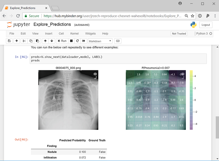
Edit: I have added activation maps to my CheXNet demo on GitHub so you can explore what drives predictions yourself. The code can be run online in your browser with no local configuration thanks to binder:

Heatmap details:
To create the heatmaps, I use the activations of Zhou et al 2015 and convert them into a probability for each of the 7x7 subregions as described in our preprint. I then calculate ln(p_subregion / p_baseline) for each of the 7x7 subregions, where p_subregion is the probability of disease based on that subregion and p_baseline is the population baseline probability of the disease.
The subregions of interest in the heatmaps may be wider than the actual subregion containing the activating finding because of convolutions that make up the architecture of the CNN.
